Plotting using Matplotlib
Credit matplotlib.org
Before we import matplotlib, we need to activate inline plotting in Jupyter
[1]:
%matplotlib inline
Then we import PyPlot from Matplotlib
[2]:
import matplotlib.pyplot as plt
Basic Plot
[3]:
plt.plot([1, 2, 4, 2])
plt.ylabel("some numbers")
plt.show()

You may be wondering why the x-axis ranges from 0-3 and the y-axis from 1-4. If you provide a single list or array to the plot() command, matplotlib assumes it is a sequence of y values, and automatically generates the x values for you. Since python ranges start with 0, the default x vector has the same length as y but starts with 0. Hence the x data are [0,1,2,3].
plot() is a versatile command, and will take an arbitrary number of arguments. For example, to plot x versus y, you can issue the command:
[4]:
plt.plot([1, 2, 3, 4], [1, 4, 9, 16])
plt.show()

For every x, y pair of arguments, there is an optional third argument which is the format string that indicates the color and line type of the plot. The letters and symbols of the format string are from MATLAB, and you concatenate a color string with a line style string. The default format string is ‘b-‘, which is a solid blue line. For example, to plot the above with red circles, you would issue:
[5]:
plt.plot([1, 2, 3, 4], [1, 4, 9, 16], "ro")
plt.axis([0, 6, 0, 20])
plt.show()

Histogram
[6]:
import numpy as np
import matplotlib.pyplot as plt

# Generate data
mu, sigma = 100, 15
x = mu + sigma * np.random.randn(10000)

# Create a histogram of the data
plt.hist(x, 50, facecolor="g", alpha=0.75)

# Add some Labels
plt.title("Histogram of IQ")
plt.xlabel("Smarts")
plt.ylabel("Probability")

# Add some text at position (60, .025). Notice, matplotlib supports TeX equation expressions
plt.text(60, 0.025, r"$\mu=100,\ \sigma=15$")
plt.grid(True)
plt.show()

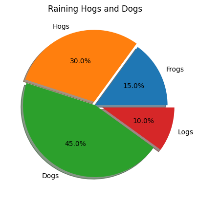
Pie Chart
[7]:
import matplotlib.pyplot as plt

# The slices will be ordered and plotted counter-clockwise.
labels = "Frogs", "Hogs", "Dogs", "Logs"
fracs = [15, 30, 45, 10]
explode = (0, 0.05, 0, 0.1)

plt.pie(fracs, explode=explode, labels=labels, autopct="%1.1f%%", shadow=True)
plt.title("Raining Hogs and Dogs")
plt.show()
[ ]: